Showing top 0 results 0 results found
Showing top 0 results 0 results found

Did you know that the typical website only converts about 2.35% of their traffic? That’s a bit sad, especially if you’re already struggling with getting more traffic.
But that’s a topic for another article.
What we’re going to focus on today is how to get the traffic you do earn to convert. If this is an issue you’re currently struggling with – you’re not alone.
Roughly 22% of businesses are happy with their conversion rates. That’s a rather low number when you think of the millions of websites online today.
The key is to continuously test and optimize your landing pages.
But what if you’re part of the 75% of companies that lack the expertise (or experts) to pull this off? If that’s the case, then we’re here to help.
Let’s take a look at seven ways you can improve your leads.
1. Create Landing Pages that Are Long (and Information-Packed)
When you visit a landing page, what do you expect to find? If you’re a consumer looking for a product or service and click on a link in an ad or to a blog post, you expect to get more information.
That’s the number one expectation your visitors have when they come to your landing page. But it’s hard to truly fulfill this when the page is too short.
It’s even found that longer landing pages can generate 220% more leads than pages with a call-to-action (CTA) above the fold.
And while this is impressive, you could potentially generate an even higher conversion rate as Aetna did. In one of their A/B split tests, they learned that the longer landing page witnessed 638% more conversions than the shorter one.
So what should you include on your landing pages to make the length worth reading?
Well, for starters, you want to pack in as much valuable information as possible. Research what your target audience needs and how you can meet that need.
In other words, focus on pain points and solutions.
2. Make Your Landings Visually Appealing with Images and Video
Now, imagine reading that long-winding landing page we just talked about. Yet, there’s nothing but a bunch of text and no visuals in sight. Sounds pretty boring, right?
When you take a look at high-converting landing pages, there’s always a ton of photos and maybe even a video or two.
Remember, your landing page is all about educating your visitors. And what better way to do that than with imagery? For instance, you can use video to demonstrate your product or service.
Or to deliver a powerful testimonial or two from satisfied customers.
Businesses that use video in their landing pages are increasing their conversions by 86%.
But what if you don’t have a product to sell and instead offer your expertise as a service? In this case, you can show how your other customers are benefiting from hiring your business.
Social proof and visual evidence are key to helping consumers make their final purchasing decision.
Get more exposure
Use our products to help your customers grow.|Watch your business grow, too.
3. Use A/B Split Tests to Continue Improving
Say you implement one or more ideas from this list and see some improvements. Should you stop there? Not at all.
In fact, you should continuously split test your landing pages to find ways to make them convert even more.

And this is exactly what some businesses are doing – those that witnessed great numbers the prior year are running 50% more tests and using 47% more methods to increase their conversion rates.
If you’re serious about improving your results, then you have to identify the problem.
Maybe it’s your headlines, your lack of images and video, or your overall copy. There’s only one way to find out and that’s with A/B split testing.
Even our last president reaped the benefits of A/B split testing. Barack Obama’s campaign was able to raise a whopping $60 million more using A/B testing.
4. Create Headlines that Entice and Engage
You learn about this in journalism, copywriting, and just about any other writing class you take. And it’s very true.
The first thing people see is your headline and instantly, they make a determination of whether or not to click and read. Another reason to pay attention to your titles is that over 90% of visitors that read the headline also read the copy.
This means if you can capture the attention of your audience with a spectacular headline, you have a great chance of getting the rest of the page read.
As you’d imagine, this can work wonders for your landing pages. But what makes a good headline?
For starters, you should avoid being drastic and never oversell on your promise. It’s common for newbies to make wild claims that aren’t true.
If the visitor clicks on your link and finds something completely different than what your headline promises, then your bounce rate will soar through the roof.
So when you’re writing your headline, you want to focus on:
- Including descriptive (yet simple) words like never, always, and you.
- Eliminating wordiness (short and sweet is best)
- Drawing visitors in with a bold, but true statement (and prove it in your content)
- Adding numbers to your headline (i.e. 5 Ways to…)
- Asking a question that’s bizarre or humorous (i.e. “Is Bloody Pink Chicken Safe to Eat? - Epicurious)
If you’re able to create headlines that create curiosity or a sense of urgency, then you’ve hit the jackpot!
5. Use Exit Intent Popups to Reduce Bounce Rates
Popups are generally annoying, especially when they’re irrelevant. But if you’re able to deliver a popup at the right time, such as when a user is about to leave, then you can potentially recapture their interest.
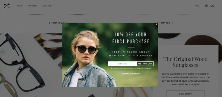
The idea is to create exit intent popups that offer something that’s hard to refuse. For example, a discount on their next order, free shipping, or a free whitepaper, ebook, or other downloadable content.
Whatever it is you offer, be sure it’s something your audience finds valuable. For instance, if you’re selling DIY gardening supplies, you can offer a free download showing users how to build their own home gardens using your supplies.
Or if you’re a consultant who helps entrepreneurial-spirited individuals start businesses, then offer a download filled with all the paperwork they need to get established legally.
Using exit intent popups for your landing page gives you a final chance to re-engage the user before they disappear forever. You can offer a limited-time offer, such as a deep discount, a freebie, or bonus materials, such as video courses.
6. Integrate Smart Triggers for Personalized Popups
Here’s where things get more interesting for popups. Envision shopping on a site that pops up with a deal on a particular product you’re interested in.
This will likely make you feel special and if the deal’s great, then you’ll quickly act on it. And this is how it’ll go with many of your visitors – if you play your cards right.
So how do you go about personalizing your popups? There are a variety of ways to do so. For example, you can have specific popups for traffic that derives from a specific source.
Let’s say you have a link to a landing page from a blog post about a specific product. Then you know the visitors that stem from this source are likely interested in that and similar products.
You can track users sources by implementing UTM codes. This will identify where the visitors came from, why they’re there, and help you to deliver personalized popups.
At Poptin, we've witnessed a case in which one of our users has increased their conversion rate by almost 90%. Let’s dive deep into the actions taken to have such a sweet increase in conversion rate.
So for starters, we’re talking about a local retailer in the vacuum cleaner business whose main goal was to collect more leads for their mailing list (as a top of the funnel action).
Let’s start by describing the main digital asset of the retailer. They have a pretty active value-packed blog which gets great feedback from clients. Another key point is that the main traffic source for their blog was SEO based, which means high-quality traffic.
The main goal was to convert those happy blog readers into subscribers, so they can enter the subscriber to client funnel.
They’ve created a nice-looking popup for the mission. After 30 days, they were able to generate a steady 3.8% conversion rate of visitors to subscribers. After sending our support team a message looking for some tips to increase conversion rate, we took a deeper look into their popup.
We’ve noticed that they created an exit-intent popup, which works great in many cases, but in their own case, we thought that trying out a different trigger might do wonders for them.
Our suggestion was to create an AB test popup for their main popup, meaning the first exit-intent version will show-up 50% of the time, and the new version will show-up also 50% of the time. We asked them to leave their current copy and design, and just change the display trigger to 50% page scroll, so the popup will show up after the visitor scrolls 50% of the page.
Long story short, they got a stunning 7.1% conversion rate for that trigger.
How do we explain this? Easy. When we talk about blog posts, a good indicator of a quality lead would be engagement with the post. When a visitor scrolls 50% of the page, we can guess the visitors like what they see, which means this is great timing to capture the visitor as a lead.
7. Stop Distracting Your Visitors
It’s easy to get carried away with your design, stories, and links. But if these are detracting from your overall goal – to convert – then they’re completely unnecessary.
You’re sabotaging your own mission to drive more leads to your business.
For instance, avoid missing the point when telling stories. Instead, focus on telling a tale that’s compelling, but that leads up (quickly) to your main point – the benefits of your product or service.
Keep in mind that your visitors are there for a reason – to find a solution. Your landing page should deliver on this with helpful information. For instance, talk about the problem they have, emphasize with the user and then sell them on your offer.
Also, avoid placing links in your content that direct them away from the page. The only type of link that should be on your landing page is your CTA. These should take them to a signup form or purchase page, depending on your CTA.
When designing your landing page, forgo the sidebar as well. You want to eliminate options – the only option from your landing page is to convert. So be sure your CTA is easy to see and understand so your visitors are more likely to act.
Become our partner
Build your business on excellent customer service products
Now It’s Your Turn
Creating killer landing pages doesn’t have to be impossible. With the right tips and knowledge, you can be well on your way to high-converting landing pages.
So continue educating yourself and give these strategies a try. Then let us know what worked for you and what didn’t!


